NationalPost App redesign

The National Post mobile redesign was a 1 day project to understand mobile useability.
Material Design
The current National Post mobile app for iOS and Android are outdated and could benefit from restyling. Material Design guidelines were used to give the app a modern look and feel.
 iPhone version
 Android version
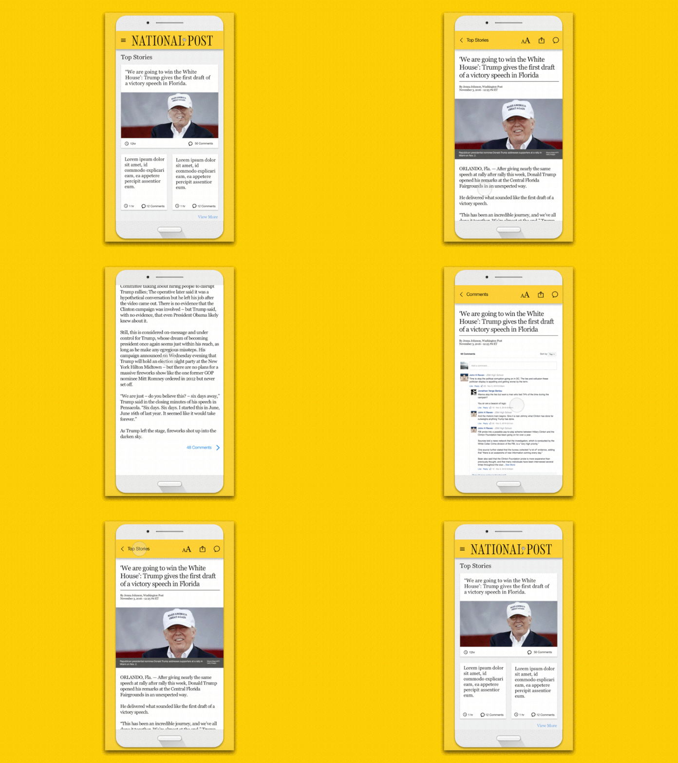
 Single article page
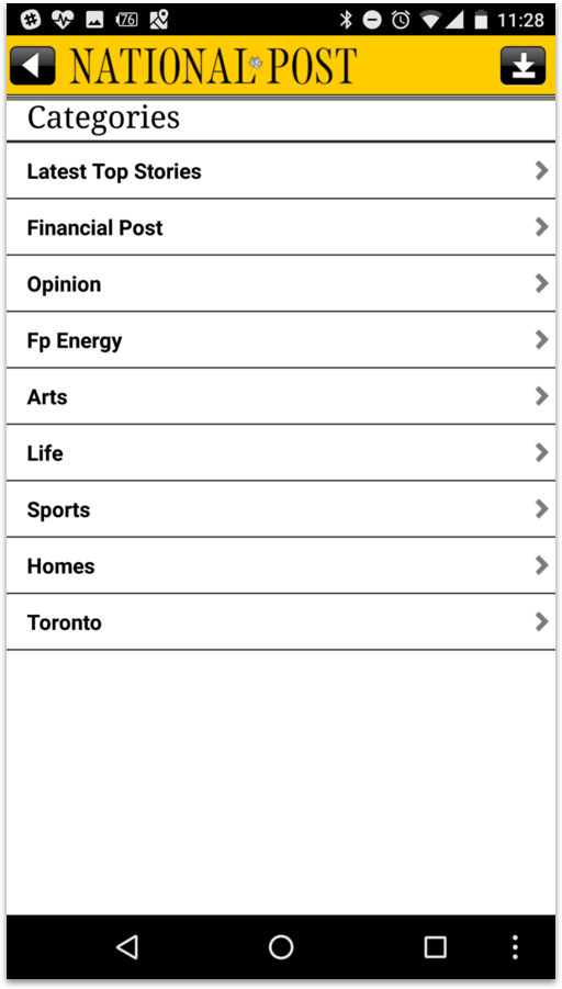
 Categories section
These are screenshots of the original Android and iOS versions of the current app available in their respective marketplaces.

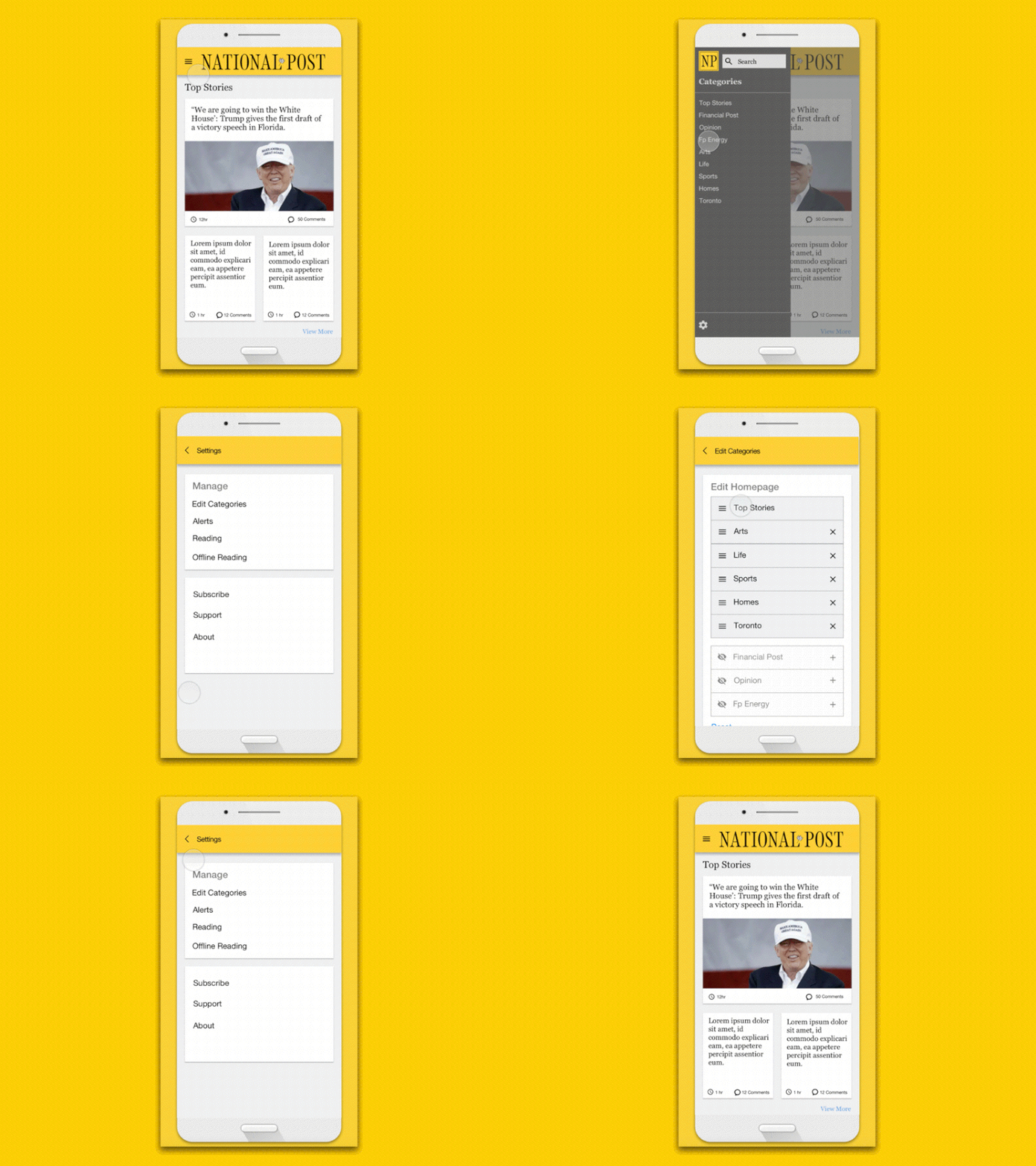
The redesigned National Post mobile app with Material Design methodology applied.
 Hamburger Menu
The current app uses a bottom line menu navigation system that takes up screen real estate. This design uses a more modern “hamburger menu” to give users more options, quickly.
 Readability
Readability should be the focus of any news app. Emphasis was given to typography, font size, line spacing, and tracking/kerning to make the text as easy-to-read as possible.