Oscar winner card redesign

The Oscar award winner's announcer card redesign was my attempt at proving that better design could have prevented an embarrasing mishap at the 2016 Academy Awards.
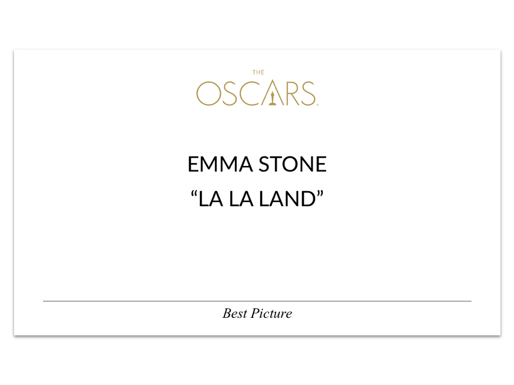
I was able to find screenshots of the card that “La La Land” producer, Jordan Horowitz held up proving that “MoonLight” was the winner of the Best Picture award. I then preproduced the “Best Actress” card based on the screenshots that were available of that card.

Original Card
The original card required the announcer to look at the bottom of the card first which reminds them of the category they are announcing, the name of the recipient is in the same font size at the movie they are in, which causes more confusion.

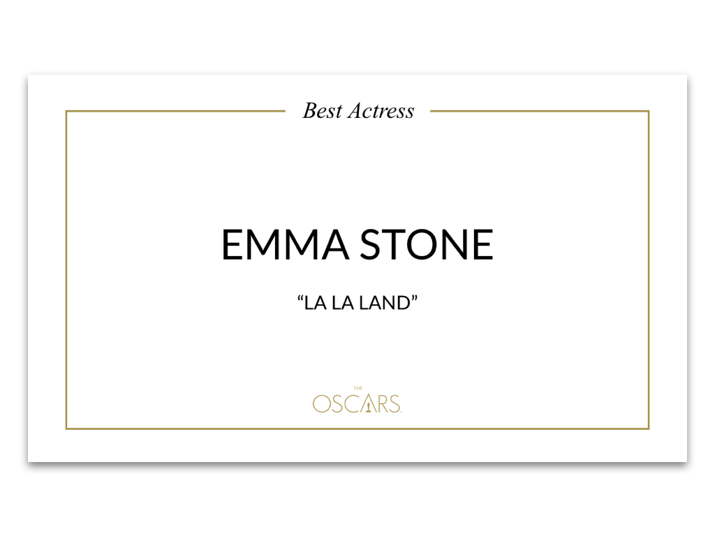
Redesigned card
Here the redesigned card has the category at the top of the card in a larger font, the winner is in a font much larger than the movie they are in, it is wrapped in a gold border which keeps the eyes in the middle of the page. I believe that if this card style was used, there would be a lot less confusion and the mishap could have been avoided.